When you try to convince people that the way forward in web design is RWD (i.e. responsive web design) you gotta show them (literally show) what is RWD, what it means and why is it important. While writing this blog post about our own RWD tool we’ve discovered a number of other RWD tools that are published on pages that are not responsive - how ironic is that?
What is RWD - Responsive Web Design?
I will simplify this a lot: responsive web design means making a website capable of adapting itself to the display on which it is viewed by the user. Since I do not believe in restating well chosen phrases, I will cite Wikipedia on this topic and say that the goal is ”easy reading and navigation with a minimum of resizing, panning, and scrolling”. You may follow the link for a more detailed discussion.


Explanations can abstract so here is the example of our own site; in a series of images you can see how www.kesolutions.biz morphs it’s layout and looks on different displays. Note how content is automatically rearranging and also note that there is no annoying horizontal scrolling.
How can I check if my site is responsive?
We talked to all our clients at some point about the need to switch to RWD. We also get consulted about web design often. One of the questions that keeps popping is this: “Isn’t my site responsive? I have a mobile version of it...”. The short answer is - not necessarily. The longer answer is that it is probably partially responsive; that means, it adapts only to so some displays. How can I check it? - is the next question.
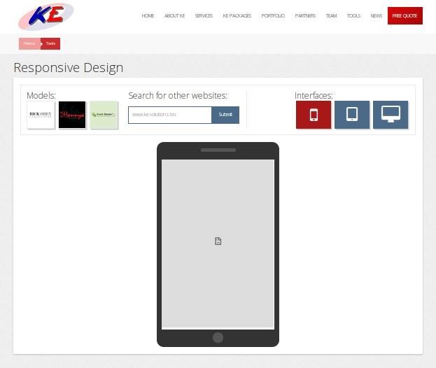
In lieu of an answer it seemed that a better idea was to put a freely available tool on our website that does exactly that: checks out how a given site looks when viewed on different devices. Even though we still plan to upgrade it and polish it, it is already functional. Here is how our RWD cheking tool looks like:

If you are not familiar with the concept of RWD, you can view several examples what responsive design looks like by clicking (on the left of the page) on one of the latest three webs that we made responsive: Rick Obey & Associates, Hannya or CashDoctor. Once you choose a model website, click in order the three most representative displays: phone, tablet or computer screen. You can see the icons on the right side of the page.
Alternatively you can type in the name of your site (or any site for that matter) inside the searchbox: for instance, www.cnn.com or www.foxnews.com (do not use http://). Surprisingly you will discover they are not fully responsive as you can see below:


The reason is both CNN and Foxnews have mobile versions (e.g. m.foxnews.com and m.cnn.com) of their sites and are relying on those. In our view this is not an elegant solution for a number of reasons, but let’s leave it for the moment.
Non-responsive RWD tools
There are score of tools for checking the responsiveness of your website. Google for instance, spits our in excess of 89 million pages when you query “responsive design tool” as keywords.
The irony is that many such tools are not themselves responsive! 
We’ve tried a number of them and it seems that their designers consistently forgot to implement responsiveness for the pages that contain their tools.
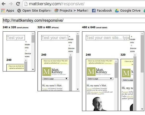
Purely as an example (although such examples abound), mattkersley.com/responsive/ comes up as the second result when searching Google for a “responsive design tool”. When this tool is asked to evaluate its own page, here is what you can see:

Now, don’t get us wrong: you can still reliably check whether your website is responsive or not with the help of such tools. The only trouble is
you have to do it from a computer screen.
It is somewhat ironic, don’t you think?
Please let us know what you think about our RWD tool and what other features you think could help you that we haven’t implemented. We value input and don’t shun criticism!


Posting comment as guest.
If you already have an account, please LOGIN.
If not, you may consider creating on. It’s FREE!