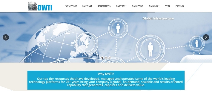
Our long time partners - DWTI - contacted us at the end of 2015 to discuss a full website re-design. Given the fact that they manage 13 data centers, 17 global POP’s, a full panoply of on-demand cloud services (IaaS, PaaS and SaaS) and the support and backing offered by business partnerships and alliances (such as AT&T, IBM/Softlayer and QTS), you can gather that we had our work cut out for us. The end result? Come February 2016, the site was live and showing significant traffic.
Fortunately, the DWTI team had a well-defined idea on how they wanted their website to focus on, the categories of information and their structuring and some valuable guidelines for us on how they wanted their website to feel. This is a really important factor since no-one knows the company and its business context better than the company itself. A lot of back and forth is being avoided if the web developer gets clearly structured information.
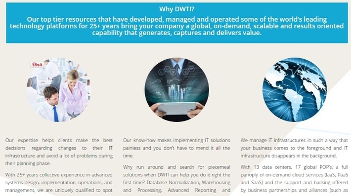
Not surprisingly, the website emphasizes their services and the core advantages DWTI offers to a wide variety of customers. The home page starts with simple slideshow followed by the key questions many customers want answered: why should I choose DWTI? Instead of letting people “hunt” for reasons, together with the DWTI we chose to be upfront about them on the website.

The website is built round a light blue theme with several secondary shades of grey to complement it. Above is a screen capture of the footer; it contains fast links to pages related to company and services, as well as contact information.
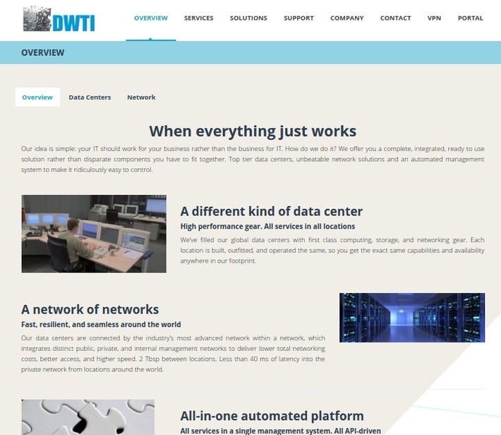
Data centers and network solutions is what DWTI does best. Since there is a lot of services on the web page, we have created a recurring overview page that summarizes each category, so that visitors know at a glance what that category is about. Interested to learn more? No problem, just click on the subcategory at the top of the page.
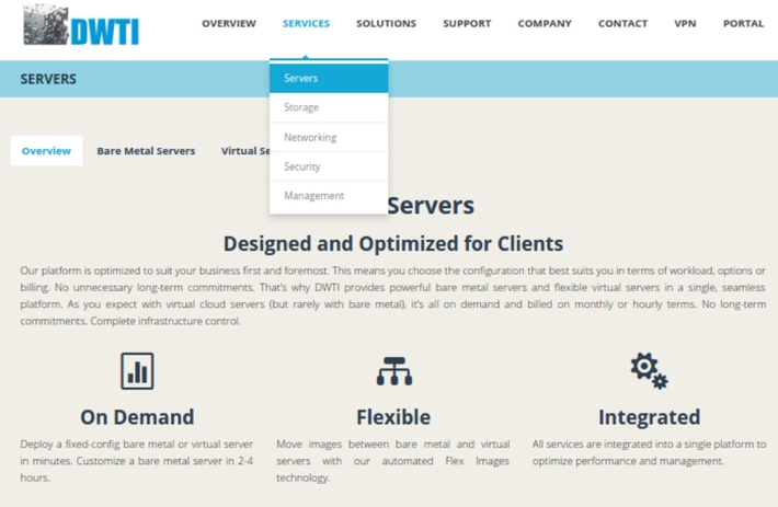
Another aspect we have invested in is the use of relevant icons. This makes navigation easier and the key points of interest more memorable. Throughout the site each category shows and overview that tries to be visually compelling and easy to follow.
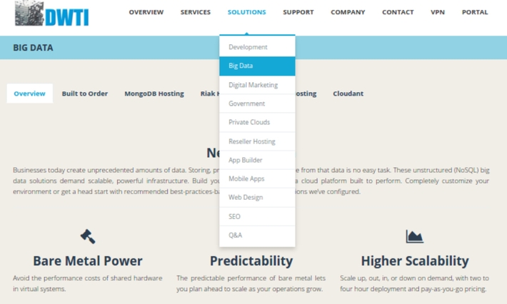
Sometimes customers know what type of problem they face without necessarily knowing the particular combination of services they need to solve it. Together with DWTI we have created a page - Solutions - that guides visitors through a more goal-oriented approach. What do they want to achieve? Here a list of solutions (see image above).
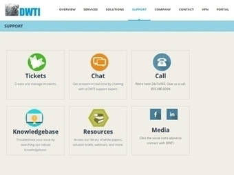
The IT world can seem confusing and somewhat daunting for people coming from the outside: a lot of jargon and unfamiliar concepts. Is this an unsurmountable obstacle? By no means! DWTI is committed - and able! - to make it everything clear via a number of channels. In the image above you can see a screen capture of their Support page. Tickets, chat, call will help you connect with a specialist, while Knowledgebase, Resources and Media allows you to search for an answer yourself.
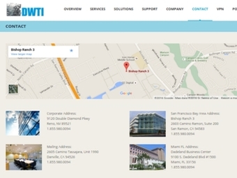
Finally, should a visitor want to contact DWTI or need to have face to face we have designed the Contact page to provide easy to follow map directions for any of the their physical locations.



Posting comment as guest.
If you already have an account, please LOGIN.
If not, you may consider creating on. It’s FREE!